 .
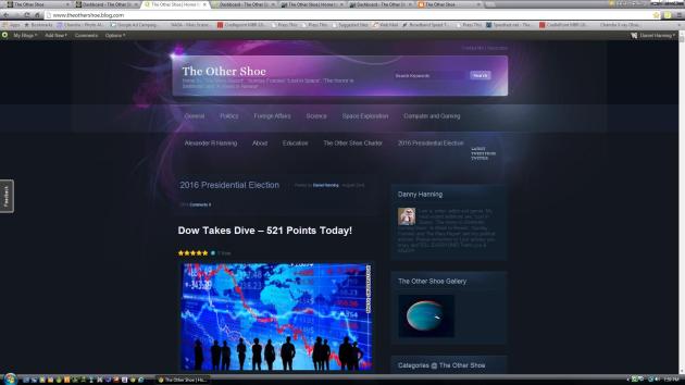
Welcome back My Dear Shoevians to The Other Shoe. For the very first time, in more than three years, I have changed the look (theme) for one of my blog locations. This location was, for the first five years, my primaryblog location at www.theothershoe.blog.com/ . For all of you, My Dear Shoevians, that are familiar with all four of my blog locations this 'new' look might catch you by surprise. Long gone is the 'Yellow Legal Pad' look of the past, and in I usher a very neon looking theme.
.
Welcome back My Dear Shoevians to The Other Shoe. For the very first time, in more than three years, I have changed the look (theme) for one of my blog locations. This location was, for the first five years, my primaryblog location at www.theothershoe.blog.com/ . For all of you, My Dear Shoevians, that are familiar with all four of my blog locations this 'new' look might catch you by surprise. Long gone is the 'Yellow Legal Pad' look of the past, and in I usher a very neon looking theme..
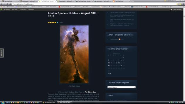
(New Look for The Other Shoe at Blog Dot Com)
.As you can see, from the images above, I have chosen to give this blog an entirely new look. From a simple, almost scholastic, look I have moved towards a sharper and even a bit flashier look. There is another reason for this change. Over the past several months I have gravitated more towards articles featuring images from space. Be they; Hubble, Curiosity or Chandra I publish more articles that contain images of the stars, than not. I like and enjoy this unwitting change. However, with the web page theme I previously possessed and used for years these images just... … … well, laid there.
.
(See how this Image Pops Off the Page?)
.Now, look at the image above. See how this image of a nebula appears; sharper, clearer, more defined and how it just seems to pop off the page? This was just the effect I was looking for. The images I have, and will continue to, share(d) need a dark background for contrast. For all too many years I placed phenomenal images on a run-of-the-mill theme. No longer. No longer will these incredible images suffer for a lack of design and presentation. Over the next month, or so, I am going to try out the three variations this theme package offers. There is this variation, a kind of purple neon. Then there is a Red Fiery variation, a blue variation and one other I cannot remember.
.
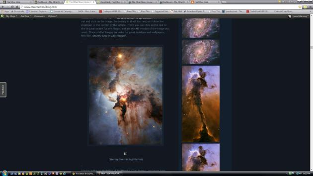
(Now, you can CLEARLY See the Difference!)
Ahhh, yes! This last image of the article really displays what I wanted. All those reds. All those blues. All those purples. They just seem to leap right off the page and into your eyes. Now my images from; the Martian surface, the Hubble space telescope, and Chandra will all get the professional presentation that they deserve. I mean, My Dear Shoevians, I have always presented these images with professional narrative and content, but now they will benefit from my words and a beautiful background for their presentation.
.
I am always open to suggestions, however, before you write me and tell me “it looks dumb, change it back...” or other like criticisms? Just give it a few days. Keep coming back, as usual, keep reading and give me a chance to show off this new theme. Let me publish my most recent article of images from Chandra. Until, after, the next edition of 'Lost in Space' and/or 'The Mars Report'. Check out just how well this theme compliments my work, then decide.
.
As always, than you for dropping by. If you have enjoyed this article, please 'Like' and 'Share' via all your social media with all your; family, friends, co-workers and acquaintances.
.
Thank you!
.
Adieu!
.
© 2010 – 2015 Hanning Web Wurx and The Other Shoe


No comments:
Post a Comment